Context
Overview
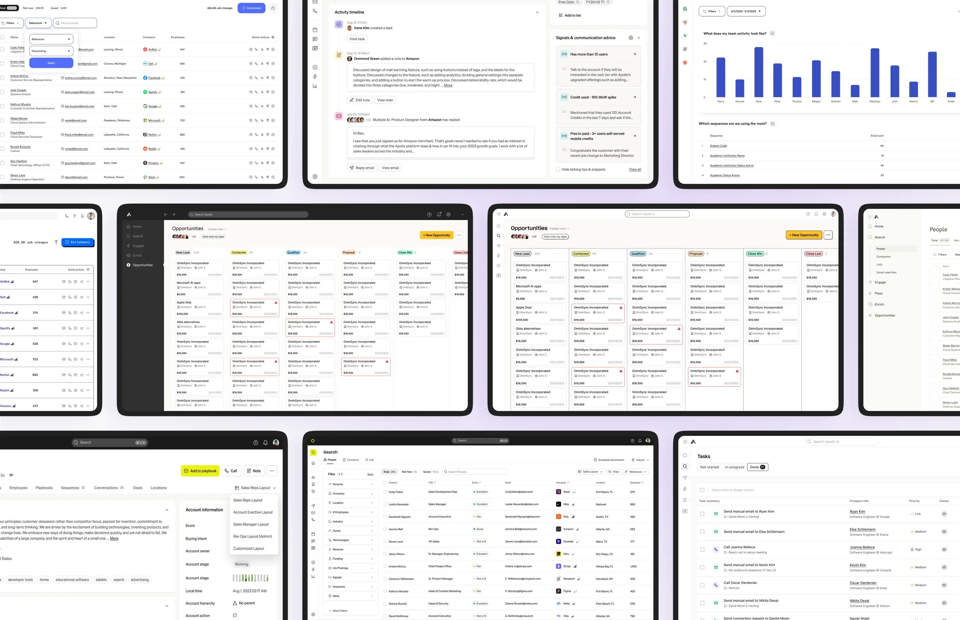
Apollo.io is a sales intelligence platform that helps SDRs and AEs prospect and enrich data. It integrates multiple data sources, automates enrichment, and surfaces insights to improve prospecting efficiency, while giving users transparency into credit usage and system actions.
My Role
I took primary responsibility for building a new design system from the ground up — to establish visual consistency across the product, align with the brand identity, and provide designers and the engineering team with reusable, customizable components that improve workflow velocity.
My main tasks involved UX research, building the components and patterns library, prototyping, auditing, testing, and documentation.
Goals
The goal was to create a comprehensive yet accessible design system that supports consistent branding, scales with the product, and simplifies handoff to engineering. Ultimately, it needed to enable the delivery of fast, high-quality user experiences, accelerate team velocity, improve visual consistency, and reduce technical debt.
UX Research
User Interviews
Moderated and unmoderated interviews were conducted with designers and engineers, focusing not only on design system usage but also on their overall experience, design-to-code translation, architecture, and organization.
Feedback Collection
Given our engaged user community, the research team was able to gather targeted feedback on specific components and patterns, as well as the overall look and feel.
Competitive Analysis
I benchmarked our design system against established systems (Material, Polaris, Carbon) to set a quality bar for architecture, tokens, accessibility, and documentation, while analyzing competitors’ interfaces to ground pattern decisions in real sales workflows.
UX Design Audit
To gain a clear understanding of the existing system, I conducted a UX audit across our designs, components, foundations, and overall experience. The analysis focused on consistency and usability. It surfaced gaps and inconsistencies and shaped the initial component inventory and standards.
Discovery
Main Pain Points
Our existing design system fell short of market standards, lacking variety and customization options. As a result, designers built large numbers of custom, local components in their files, which created duplicates and added clutter to the system.
Outdated library
Limited and inconsistent components and variants, coupled with a lack of customization.
Missing guidelines
Basic experience missing key guidelines, modern workflows, and up-to-date design features.
Accessibility gaps
Foundational principles (contrast, text and target size) fell below current WCAG standards.
Ideation
UI Direction Workshops
We brought together a group of proactive designers to explore potential directions for the product UI. Each designer presented their concept, and through a voting process, we selected the main direction — which became the basis for further UI work.
Component Inventory
Based on an internal audit of existing components in Figma and Storybook, along with a competitor analysis, I compiled a full list of components and patterns, assigning a priority to each.
Accessibility Baseline
Prioritize accessibility at every stage of designing new components and foundations, meeting WCAG 2.2 AA — sufficient color contrast, text size, minimum target sizes, accessible iconography, and screen reader support.
Responsive Approach
Prioritize an intuitive experience across screen sizes — building responsive components that adapt across breakpoints and adding mobile-specific patterns such as bottom sheets.
Design
This stage focused on empowering designers with the flexibility of extensive customization, balanced against best design practices. Delivering that required ongoing collaboration across the internal Design System team, Engineering, Marketing, Copy, and all product design teams.
Iterative Design
This workflow was followed for every new set of components in our Design System.
Setting Up the Foundations
Following an atomic approach, we defined the structural and stylistic foundations of the Design System, along with its style guide. This involved working on the grid, spacing, screen layouts, color palette, typography, sizing, border radius, states, shadows, and iconography.
Layout and grid
- The constrained layout is built upon a 12-column system. The system adapts gracefully to smaller screen sizes by gradually reducing the number of columns.
- A 4px grid, with major jumps on an 8px scale, used to arrange components on a page.
Typography
- Built on a 16px base with a step-ladder function and INT rounding for clean, grid-aligned whole numbers, extending down to smaller steps for dense data contexts. Narrowed to the core sizes most used across the product.
- Defined for alignment, line height (125% headers, 150% body, tuned to a 4pt grid), letter-spacing, and paragraph spacing.
- Capped at 70–80 characters per line (~520px body width), with headers kept short.
- Mono variants at both subheading sizes for IDs, codes, and tabular values, so numeric content stays aligned without ad-hoc overrides.
- Two token tiers, mirroring color: primitives hold the raw font, size, weight, and line-height values; semantic text styles bind them into named roles, so a size or leading change updates everywhere it’s used.
Color palette
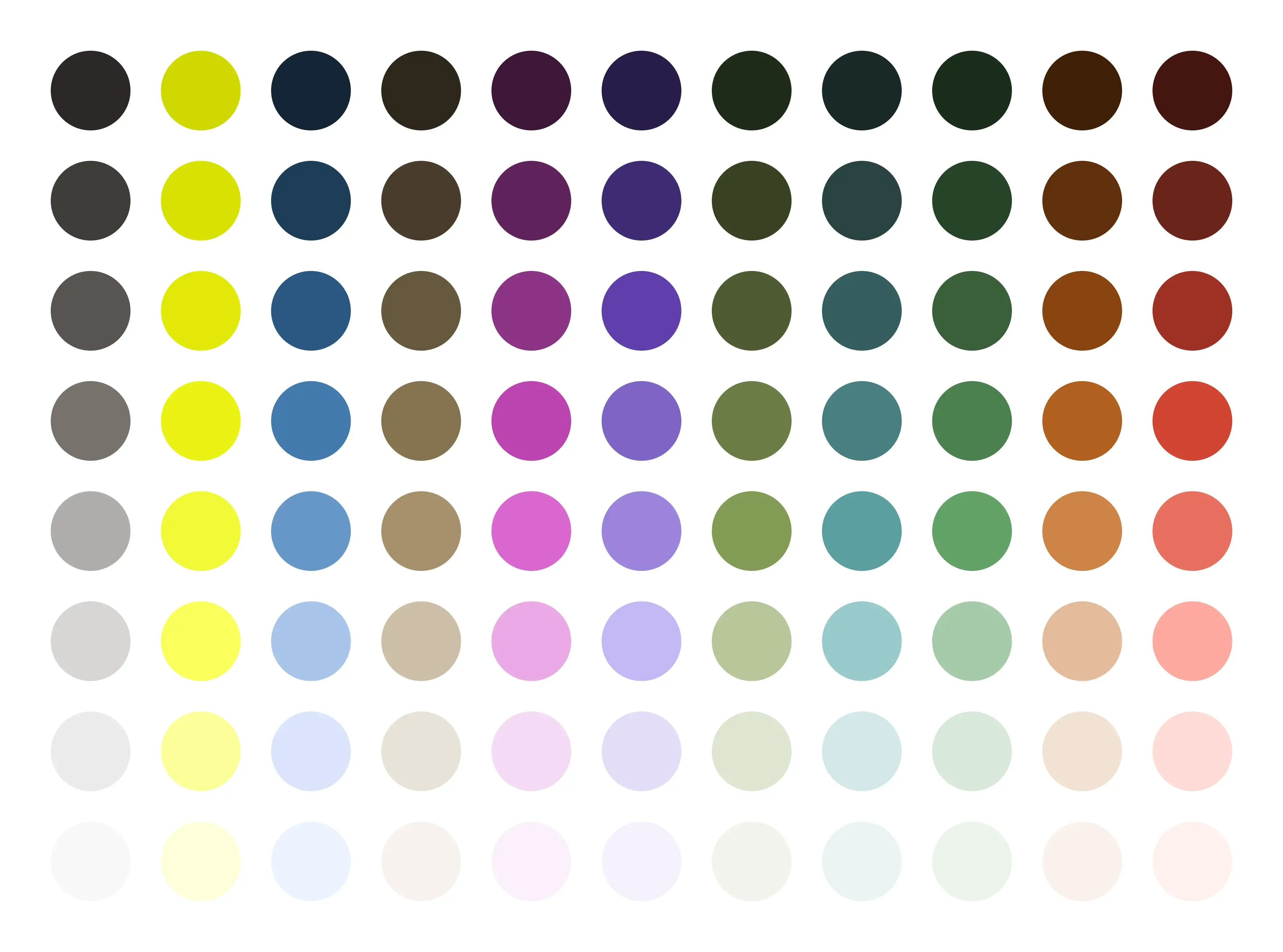
- 11 base colors with up to 8 shades each, plus a dedicated 10-hue data-visualization palette, which is a significant expansion from the previous system.
- A base shade defined for every color to ensure WCAG compliance, verified for both small text and graphics.
- A range of hues and shades covering every use — text, surfaces, borders, states, illustrations, and data visualization.
- Two token tiers: primitives define the raw palette; semantics assign each value a role, so nothing in the product references a hex value directly.
- Every primitive holds a light and a dark value, so theming is a mode switch, not a second palette to maintain.
Elevation
- A 5-level scale built from soft, layered shadows for realistic depth without harsh, artificial edges.
- Left, right, and top shadow variants, each with light and dark mode support, so elevation adapts to context and surface.
- Hierarchy guidance per level, including shadow usage on colored backgrounds and the shift between flat and neumorphic styling.
Components
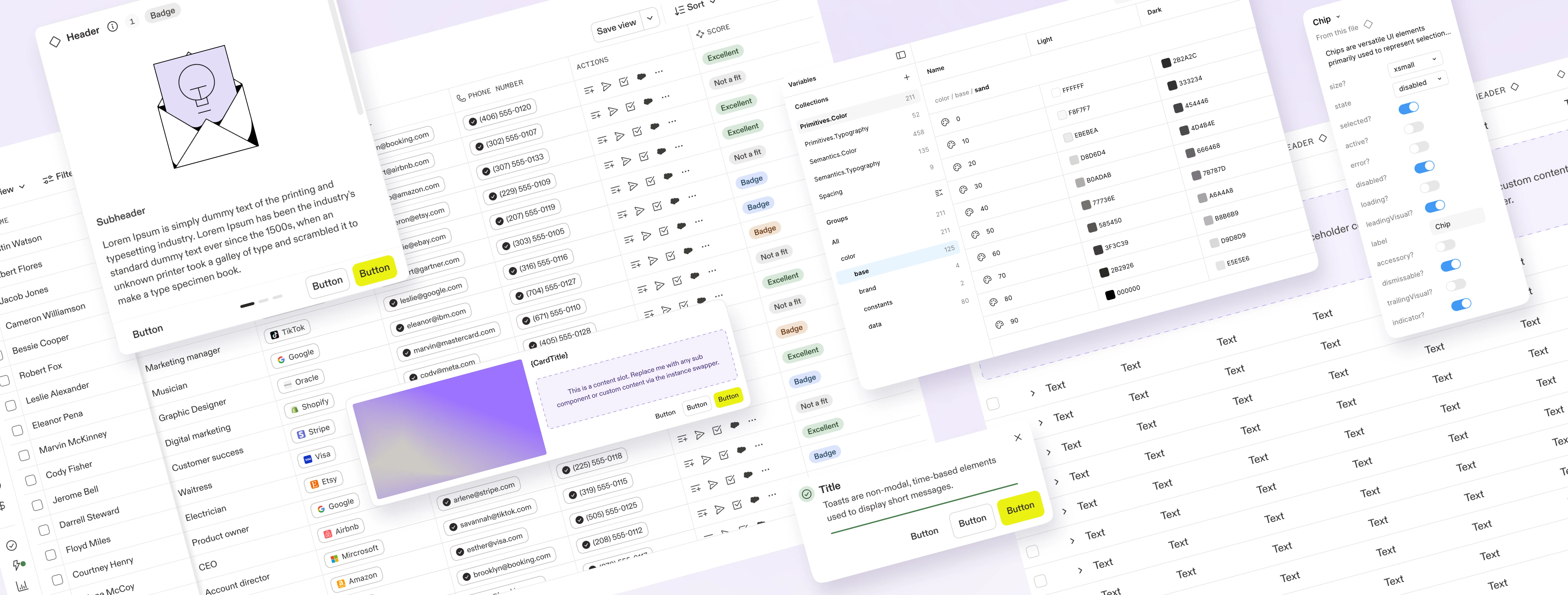
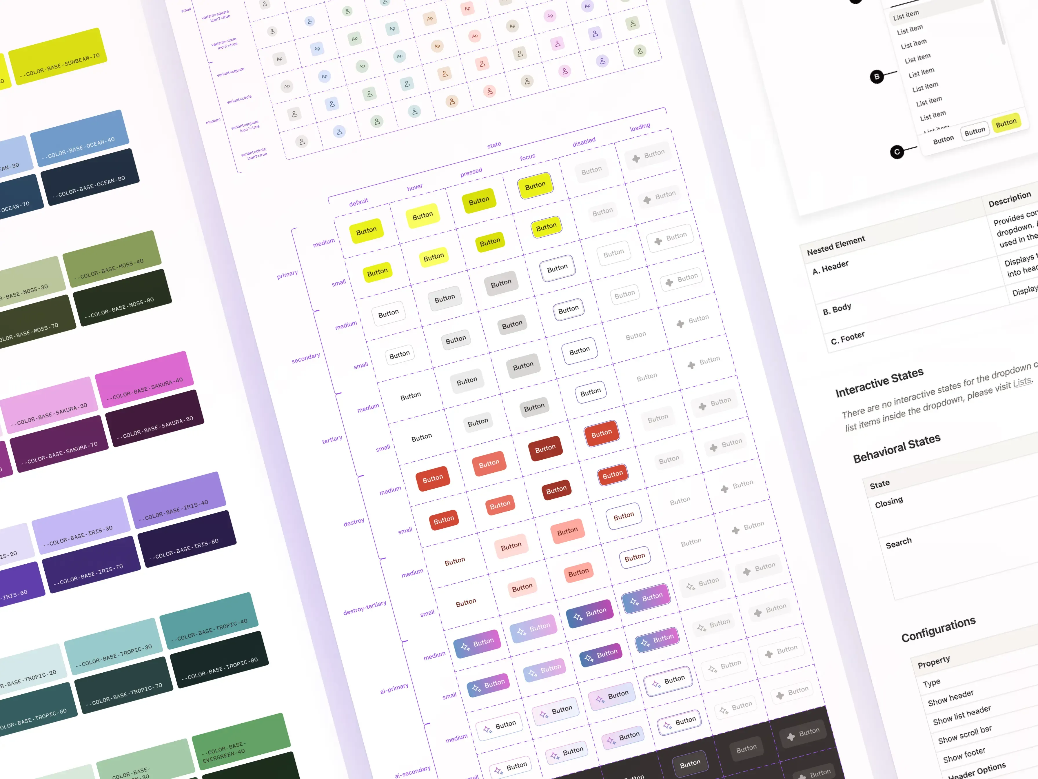
We designed a comprehensive library of 54 components, each offering diverse styles, sizes, shapes, and states to cater to a wide range of design needs. Each component was designed to meet accessibility standards, with built-in variants and out-of-the-box behaviors.
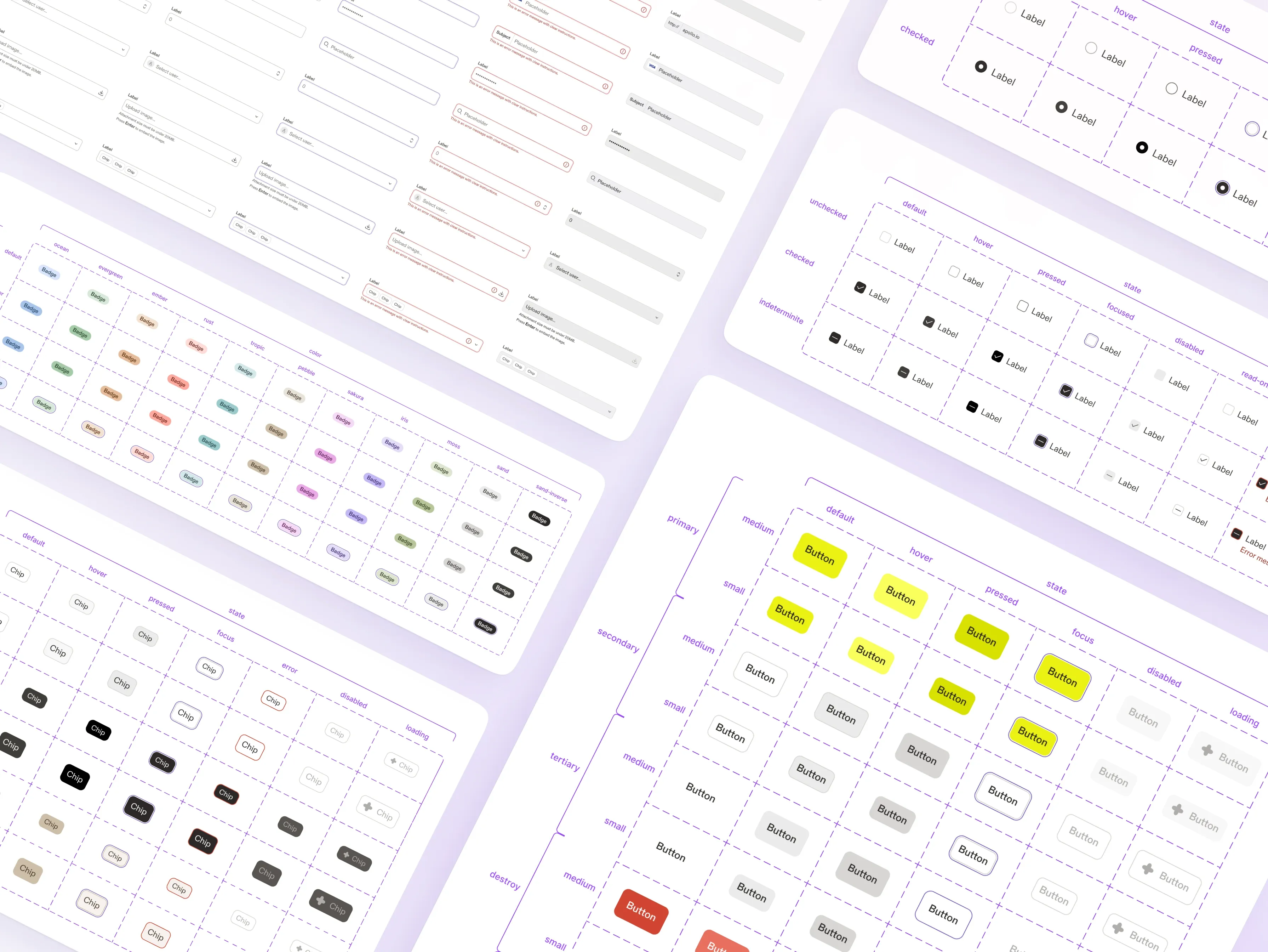
Design critiques
Every 2-3 newly designed components underwent a design critique: a one-hour moderated session where we presented the UI components to a focus group of three to seven designers. Participants were asked to explore and test the components, after which we collected feedback from each of them. The final step was incorporating that feedback into the next design iteration.
Documentation & Guidelines
As the final step in the design process, comprehensive documentation was created in Zeroheight to serve as the single source of truth. It included detailed documentation for each component, covering anatomy, specifications, variations, behaviors, states, sizes, shapes, and accessibility considerations. It also outlined usability best practices, usage guidelines, and key insights from the design critiques.
Next Steps
Components QA
Detailed check of each component, comparing Storybook to Figma and reviewing it against the QA checklist.
Requests & contributions
Gathered and prioritized designers' requests, ranging from bug fixes and corrections to new component creation.
Feedback collection
Collected data through surveys, focusing on identifying pain points and opportunities for improvement.
Takeaways
Building a design system from the ground up proved to be as much an organizational effort as a design one. Here are a few lessons I learned from this project:
- Creating and managing a design system at scale: Learned how to build and manage a design system by creating customizable components, patterns, and variables while enabling teams to use the system effectively.
- Navigating ambiguity: Learned to move forward without having all the answers, overcome obstacles, and test multiple ideas throughout the process.
- Receiving feedback and iterating: Continuously collaborated with teams and stakeholders to gather feedback on constraints, limitations, and requirements, then iterated on components based on that feedback.